Seaborn has long been a go-to tool for statistical plotting in Python. While it may not be as powerful as R’s ggplot2, it’s widely used due to the lack of better alternatives. However, this is changing with the rise of excellent packages like plotnine.
One of the biggest drawbacks of Seaborn, in my opinion, has been its inconsistent syntax, which contrasts with the predictable and intuitive syntax of ggplot2 and plotnine, both based on the grammar of graphics. Recently, Seaborn has introduced an object interface. While not strictly based on the grammar of graphics, it offers a well-structured syntax.
Today, we will explore some aspects of the Seaborn object interface. Note that, in my opinion, the Seaborn object interface is still in its beta stage.
#Let's call the traditional seaborn so that we can load the datasets
import warnings
warnings.simplefilter("ignore", category=FutureWarning)

import seaborn as sns


# and then the object interface
import seaborn.objects as so
#load a sample dataset
fmri = sns.load_dataset("fmri")  # Example dataset
print(fmri.head())
  subject  timepoint event    region    signal
0     s13         18  stim  parietal -0.017552
1      s5         14  stim  parietal -0.080883
2     s12         18  stim  parietal -0.081033
3     s11         18  stim  parietal -0.046134
4     s10         18  stim  parietal -0.037970
(
    so.Plot(fmri,x= "timepoint", y="signal")
      .add(so.Line())
)
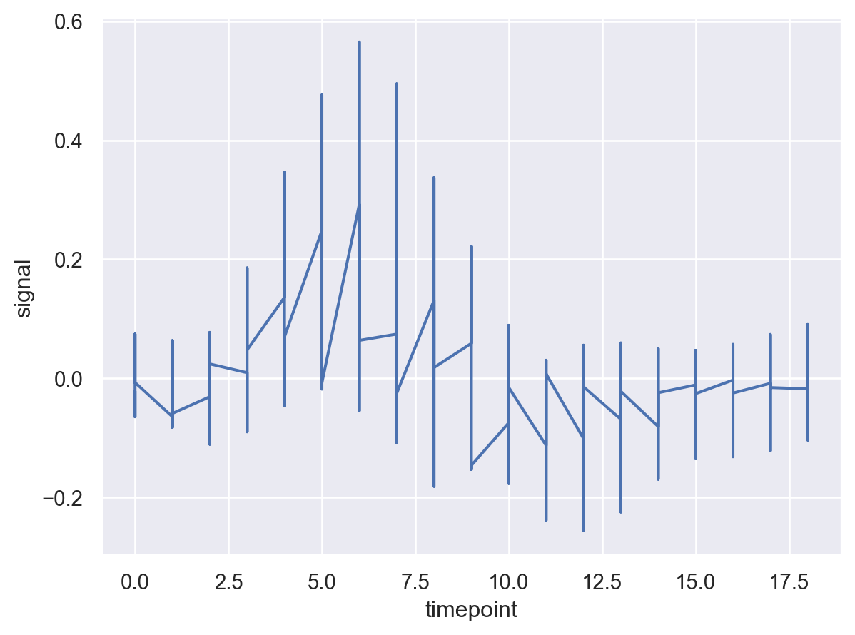
This does not look very informative. Let’s aggregate signal at each timepoint.
(
    so.Plot(fmri,x= "timepoint", y="signal")
      .add(so.Line(),so.Agg('mean'))
)
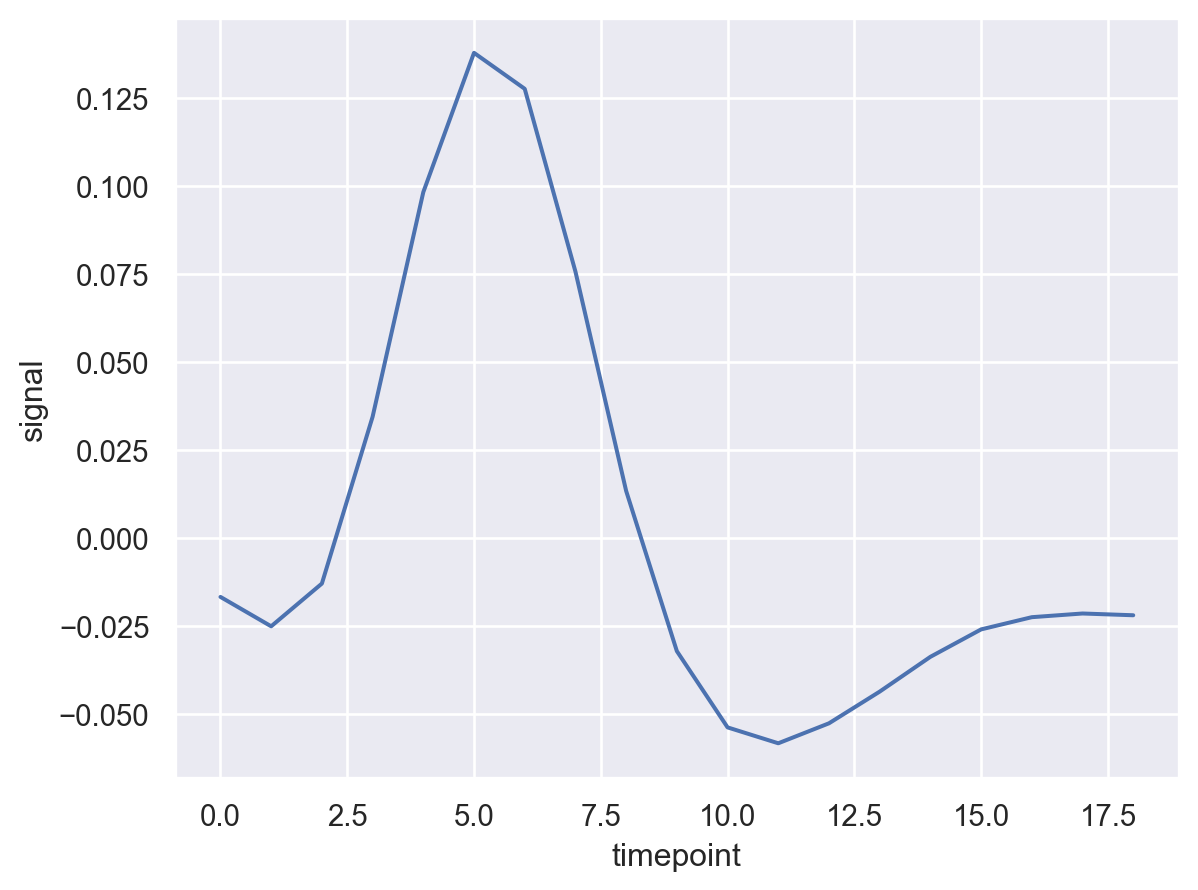
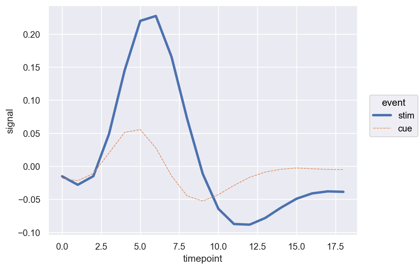
Well this looks more clean. Now let’s break the line by ’event'
(
    so.Plot(fmri,x= "timepoint", y="signal",color='event')
      .add(so.Line(),so.Agg('mean'))
)
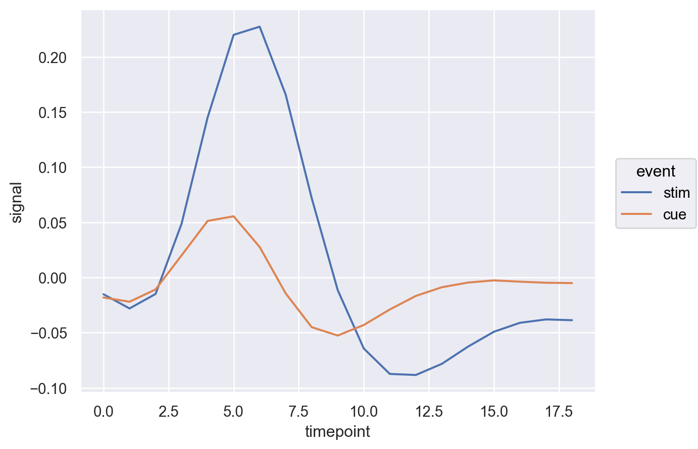
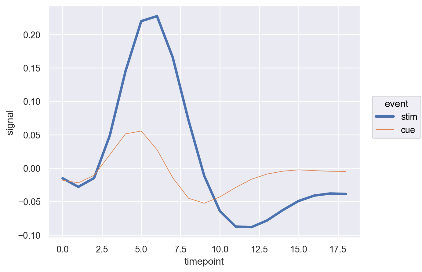
That is nice but lets also change the linewidth.
(
    so.Plot(fmri,x= "timepoint", y="signal",color='event',linewidth="event")
      .add(so.Line(),so.Agg('mean'))
)
How about changing the linestyle too!
(
    so.Plot(fmri,x= "timepoint", y="signal",color='event',linewidth="event",linestyle='event')
      .add(so.Line(),so.Agg('mean'))
)
We notice how easy it is to make incremental changes in seaborn object interface. Now let’s add another dimension i.e. region to the plot.
(
    so.Plot(fmri,x= "timepoint", y="signal",color='region',linewidth="event",linestyle='event')
      .add(so.Line(),so.Agg('mean'))
)
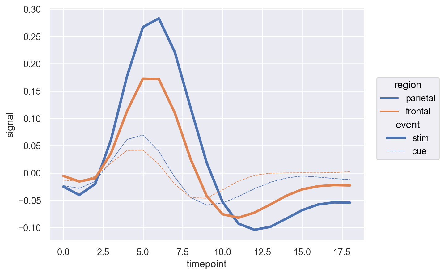
Hmmm so this is not so clear after all. How about we change the region to the bar.
(
    so.Plot(fmri,x= "timepoint", y="signal")
      .add(so.Line(color='blue'),so.Agg('mean'),linewidth="event",linestyle='event',)
      .add(so.Bar(), so.Agg(),color='region')
      .scale(color={'parietal':'red','frontal':'green'},
             linewidth={'cue':3,'stim':1},
            linestyle={'cue':'solid','stim':'dashed'})
)
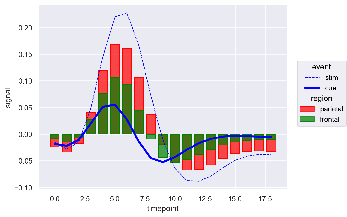
Now there’s a lot to unpack. We notice that the bar colors are green and red as specified, and the lines are blue as specified in so.Line(). Additionally, linewidth and linestyle are consistent with the values passed in scale. But can we control both the color of bars and lines simultaneously? Let’s give it a try.
(
    so.Plot(fmri,x= "timepoint", y="signal")
      .add(so.Line(),so.Agg('mean'),linewidth="event",linestyle='event',color='event')
      .add(so.Bar(), so.Agg(),color='region')
      .scale(color={'cue': 'blue', 'stim': 'black', 'parietal':'red','frontal':'green'},
             linewidth={'cue':3,'stim':1},
            linestyle={'cue':'solid','stim':'dashed'})
)
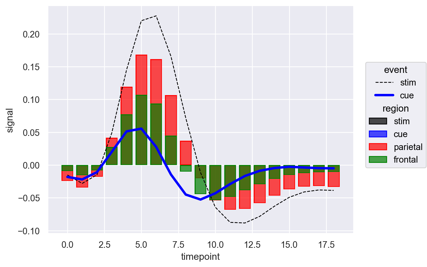
Indeed that worked and we can color both bars and lines. However, now the issue is legend. Under region dimension we have values for both event and region. Pheww! As I mentioned earlier, object interface is still in beta and legend is not yet perfect. It seems like we have finally hit the roadblock. However the good part about object interface or seaborn in general is that it is built on top of the matplotlib.
import matplotlib.patches as mpatches
import matplotlib.lines as mlines

sns.set_theme()

fig, ax = plt.subplots()

(
    so.Plot(fmri,x= "timepoint", y="signal")
      .add(so.Line(),so.Agg('mean'),linewidth="event",linestyle='event',color='event')
      .add(so.Bar(), so.Agg(),color='region')
      .scale(
             linewidth={'cue':3,'stim':1},
             linestyle={'cue':'solid','stim':'dashed'},
             color={'cue': 'blue', 'stim': 'black', 'parietal':'red','frontal':'green'},)
      .on(ax)
      .plot()
)

legend=fig.legends.pop(0)

# Manually create legend handles
line_cue = mlines.Line2D([], [], color='blue', linewidth=3, linestyle='solid', label='cue')
line_stim = mlines.Line2D([], [], color='black', linewidth=1, linestyle='dashed', label='stim')
bar_parietal = mpatches.Patch(color='red', label='parietal')
bar_frontal = mpatches.Patch(color='green', label='frontal')

# Add the custom legend
handles = [line_cue, line_stim, bar_parietal, bar_frontal]
labels = [handle.get_label() for handle in handles]

fig.legend(handles, labels,
           bbox_to_anchor=(0.75, -0.05),
           frameon=False,
           fontsize=10,
           ncols=4)
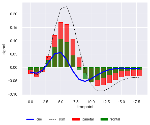
This is finally what we wanted. So utilizing matplotlib we managed to get it done and let’s hope seaborn object interface in future natively handles it.