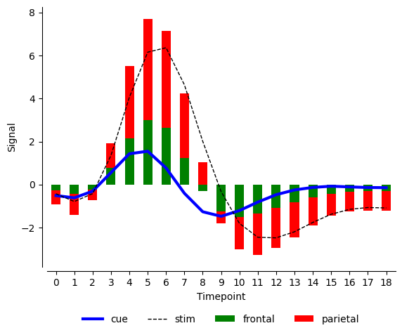
We have covered seaborn object interface (https://datavizs.com/posts/python/seaborn_object_interface_24_08_06/) and how we can control properties like color, style, width etc. We also came across a situation where legend was messed up when we came across more complicated situations. We also tried to overcome some of those limitations using matplotlib. It was easy to manipulate seaborn plot with matplotlib because seaborn is built on top of matplotlib and the fig and ax are more natively accessible.
Now we will cover the same case using plotnine and see how it fares. We will also try to see if we can get fig, ax from plotnine directly in matplotlib for further modification.
Generating same plot using plotnine
import pandas as pd
import seaborn as sns


from plotnine import (
    ggplot, aes, geom_line, geom_bar, scale_color_manual, scale_fill_manual,
    scale_linetype_manual, scale_size_manual, theme_minimal, stat_summary, theme,labs
)
from numpy import mean

# Load the fmri dataset from seaborn
fmri = sns.load_dataset('fmri')

# Create the plot with aggregation directly in ggplot
plot = (
    ggplot(fmri) +
    stat_summary(aes(x='timepoint', y='signal', fill='region'),
                 fun_y=mean,  geom='bar',  position='stack') +
    stat_summary(aes(x='timepoint', y='signal', color='event', linetype='event', size='event'),
                 fun_y=mean,  geom='line') +
    scale_color_manual(values={'cue': 'blue', 'stim': 'black', 'parietal': 'red', 'frontal': 'green'}) +
    scale_fill_manual(values={'cue': 'blue', 'stim': 'black', 'parietal': 'red', 'frontal': 'green'}) +
    scale_size_manual(values={'cue': 2, 'stim': 1}) +
    scale_linetype_manual(values={'cue': 'solid', 'stim': 'dashed'}) +
    theme_minimal()+
    theme(figure_size=(10, 6), dpi=300)
)
plot
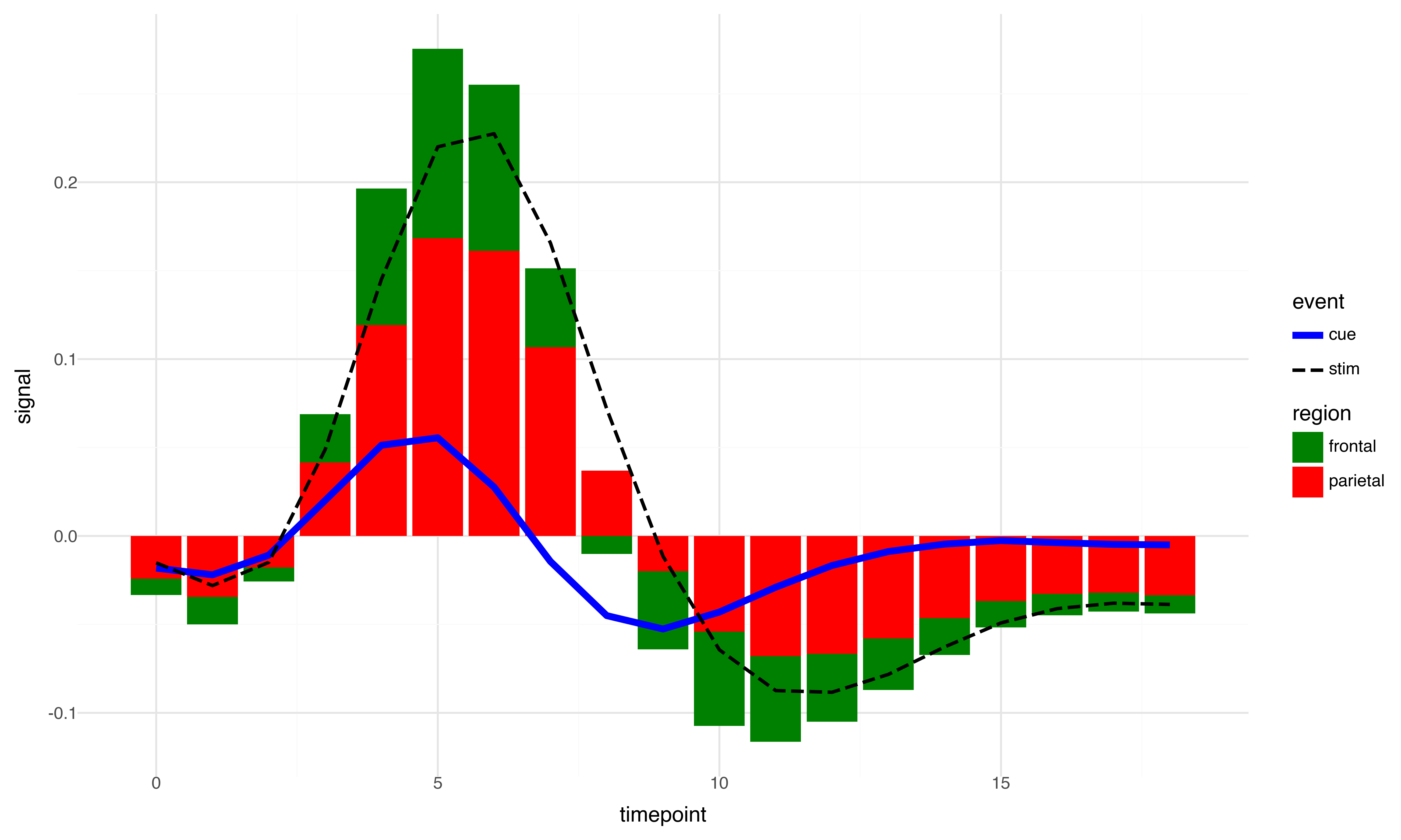
So we see it’s much easier to control the properties and even the legend is not messed up as it was the case with seaborn object interface. Now the next step is to try to see if we can access the plot from plotnine with the same ease that we can do it for Seaborn. After all both plotnine and seaborn are built on top of matplotlib. But the answer is not so straightforward. Plotnine on stand alone is great and is doing great job mimicking R’s ggplot2 in python. However, unlike python R does not have matplotlib. And ggplot2 for all practical purpose is good enough for majority of cases. But we expect more from python because it is a more general-purpose language. So, it is imperative that we check whether we can manipulate plotnine plots in matplotlib. Let’s give it a try.
We will take a simple use case of changing x and y axis labels. Please note we can do so directly inside plotnine but this is for demonstration purpose only.
fig = plot.draw()
axs = fig.get_axes()
for ax in axs:

    ax.set_ylabel('Signal')
    ax.set_xlabel('Timepoint')


fig
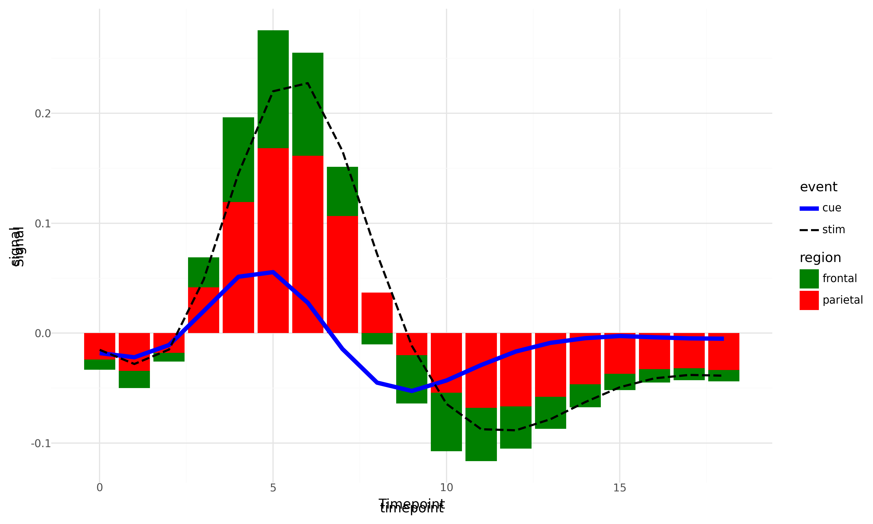
So, what does the above plot tells us? Even if we can export plotnine plot to matplotlib, we only get a picture of it and not the pure matplotlib fig, ax as is the case with Seaborn. We can overcome some of these challenges by making sure the properties that we intend to manipulate using matplotlib, we don’t generate them in plotnine to begin with. But all these are workarounds, and the underlying limitation persists. Anyway, it does not make plotnine any less useful and it is still much more robust that seaborn object interface as of this point.
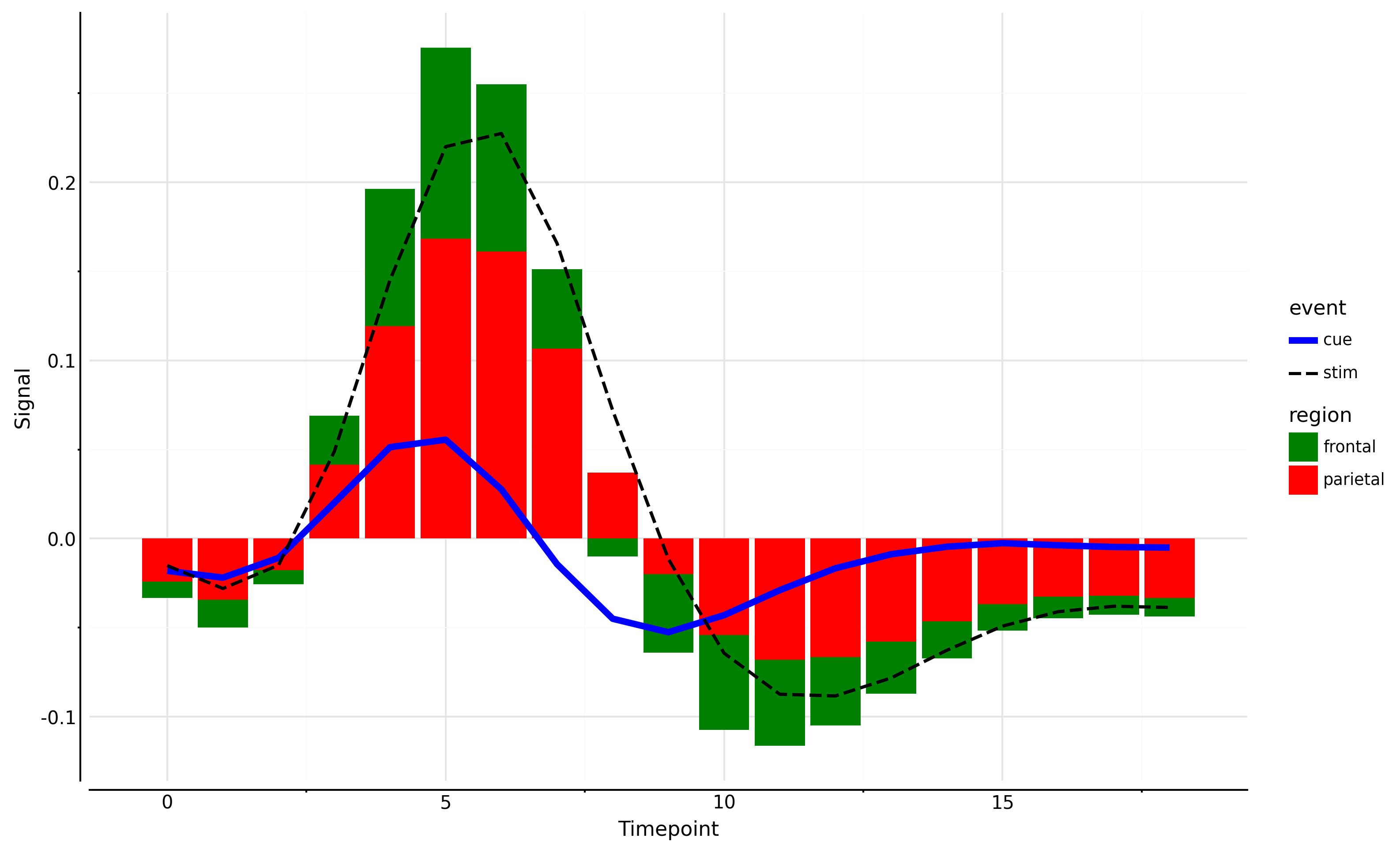
## Full code

import pandas as pd
import seaborn as sns


from plotnine import (
    ggplot, aes, geom_line, geom_bar, scale_color_manual, scale_fill_manual,
    scale_linetype_manual, scale_size_manual, theme_minimal, stat_summary
)
from numpy import mean

# Load the fmri dataset from seaborn
fmri = sns.load_dataset('fmri')

# Create the plot with aggregation directly in ggplot
plot = (
    ggplot(fmri) +
    stat_summary(aes(x='timepoint', y='signal', fill='region'),
                 fun_y=mean,  geom='bar',  position='stack') +
    stat_summary(aes(x='timepoint', y='signal', color='event', linetype='event', size='event'),
                 fun_y=mean,  geom='line') +
    scale_color_manual(values={'cue': 'blue', 'stim': 'black', 'parietal': 'red', 'frontal': 'green'}) +
    scale_fill_manual(values={'cue': 'blue', 'stim': 'black', 'parietal': 'red', 'frontal': 'green'}) +
    scale_size_manual(values={'cue': 2, 'stim': 1}) +
    scale_linetype_manual(values={'cue': 'solid', 'stim': 'dashed'}) +
    labs(y="",x="") + #ensure we wre not creating any label in plotnine so that it does not overlap with matplotlib.
    theme_minimal()+
    theme(figure_size=(10, 6), dpi=300)
)

fig = plot.draw()
axs = fig.get_axes()
for ax in axs:

    ax.set_ylabel('Signal')
    ax.set_xlabel('Timepoint')
    ax.spines['left'].set_visible(True)
    ax.spines['bottom'].set_visible(True)
    ax.spines['left'].set_position(('outward', 5))
    ax.spines['bottom'].set_position(('outward', 5))

fig
Additional Note
For simple use cases if you want a good balance between ease of use and easy control over matplotlib we can try plot_x which I have built on top of pandas plot which in fact is built on matplotlib. I have covered pandas plot in lot more detail here (https://datavizs.com/posts/python/pandas_plot_24-07-31/). In one of these days, I will write a bit more about plot_x in pytae package. For now, one of the biggest limitation of pandas plot was that it works great with wide data and not so great with long data. plot_x simply overcomes that limitation. Additionally, you can directly pass matplotlib **kwargs to plot_x because plot_x is built on top of pandas plot which accepts matplotlib **kwargs directly. This in fact is a great strength of pandas plot and I am sure I am not explaining its importance very well:).
import pytae
import matplotlib.pyplot as plt

color={'cue': 'blue', 'stim': 'black', 'parietal': 'red', 'frontal': 'green'}
style={'cue':'-','stim':'--'}
width={'cue':3,'stim':1}

fig, ax = plt.subplots()
plt.close()
fmri.plot_x(x='timepoint',y='signal',by='event',aggfunc='sum',
            ax=ax,
            color=color,
            style=style,
            width=width
           )
fmri.plot_x(x='timepoint',y='signal',by='region',
            aggfunc='sum',kind='bar',ax=ax,stacked=True
           ,xlabel='Timepoint',ylabel='Signal',color=color)
fig