There are various excellent tools for plotting in both Python and R. Arguably, for most statistical plots, ggplot2 is the best. I have tried plotnine and seaborn in Python. While both are excellent packages, neither comes close to R’s ggplot2 in terms of ease of use, documentation, and resources. ggplot2, based on the grammar of graphics concept, has a well-structured and consistent framework, a large community, and an excellent extension ecosystem that enhances its usability.
In Python, seaborn performs well but significantly lags behind ggplot2. Recently, I feel plotnine is becoming the go-to tool for plotting in Python. Seaborn has introduced an object-oriented interface, which is a step in the right direction. However, having two competing interfaces—the traditional seaborn and the new object-oriented interface—can be tedious for beginners. Seaborn could benefit from fully investing in its object-oriented interface and retiring the traditional one.
Plotnine, on the other hand, aims to replicate ggplot2 in Python. The code is as similar to ggplot2 as possible in Python. However, it remains a copy of ggplot2.
There are various other tools and frameworks in Python that users can choose, such as plotly, pandas plot, or pure matplotlib. If the graph involves statistical elements, it is better to use R’s ggplot2 or Python’s seaborn or plotnine. However, for general-purpose graphing, I have found pandas plot to be very useful. It provides a good balance between flexibility and ease of use. If you want to be really imaginative, nothing is as great as matplotlib. However, with matplotlib we need a lot more code because it is highly customizable.
Almost all Python graphing packages are built on top of matplotlib. Any plot created using seaborn or plotnine can be manipulated using matplotlib. However, these packages have their own sets of syntax baggage. In this situation, pandas plot is a great alternative. The most interesting thing about pandas plot is that it has a very limited set of its own arguments or keyword arguments, but it accepts almost all **kwargs of matplotlib directly inside the pandas plot function. Also, there are certain use cases where pandas plot is more convenient than ggplot2, seaborn, or plotnine. However, there is one small issue with pandas plot: it does not accept tidy data. It works well with wide data where the x-axis is ideally the index. But we can easily overcome this limitation using a wrapper function that accepts long data.
Below is the example of a wrapper function.
#wrapper function
import seaborn as sns #only required to import datasets.
import pandas as pd
import matplotlib.pyplot as plt

#wrapper function
def plot_x(self, ax=None, x=None, y=None, by=None, aggfunc='sum', dropna=False, **plot_kwargs):

    show_legend = plot_kwargs.pop('legend', True)

    pivot_table = self.pivot_table(index=x, columns=by, values=y,
                                   aggfunc=aggfunc, dropna=dropna,observed=False).reset_index()
    pivot_table[x]=pivot_table[x].astype('object') #numeric x label creates issue

    # Plot the data
    ax = pivot_table.plot(ax=ax,x=x, **plot_kwargs)

    if show_legend:
        ax.legend(loc='upper center', bbox_to_anchor=(0.5, -0.15), ncol=10, frameon=False)

    return ax


pd.DataFrame.plot_x = plot_x
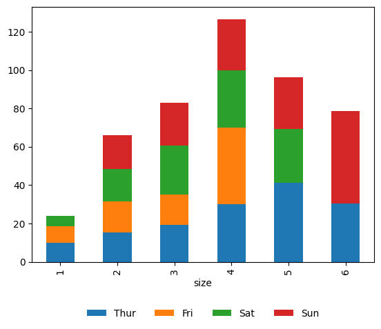
Below is one such example where we are plotting tips dataset. We can import this via seaborn for ease. Let’s say the goal is to plot stacked bar plot for each group size. And the bar stack is based on day of the visit.
tips = sns.load_dataset("tips")
fig, ax = plt.subplots()

tips.plot_x(ax=ax,x='size', y='total_bill', by='day', aggfunc='mean',
          kind='bar',stacked=True,legend=True)
plt.show()
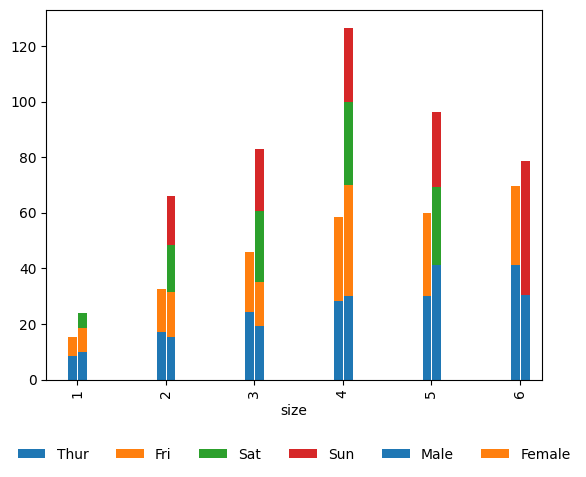
Now let’s say we want to also show distribution by the sex. We can simply do this by passing matplotlib’s width and position kwargs directly inside pandas plot. This is extremally flexible approach.
fig, ax = plt.subplots()


tips.plot_x(ax=ax,x='size', y='total_bill', by='day', aggfunc='mean',
          kind='bar',stacked=True,legend=True, width=+0.1 ,position=-.1)
tips.plot_x(ax=ax,x='size', y='total_bill', by='sex', aggfunc='mean',
          kind='bar' , stacked=True,legend=True,dropna=True, width=+0.1 ,position=1)
plt.show()
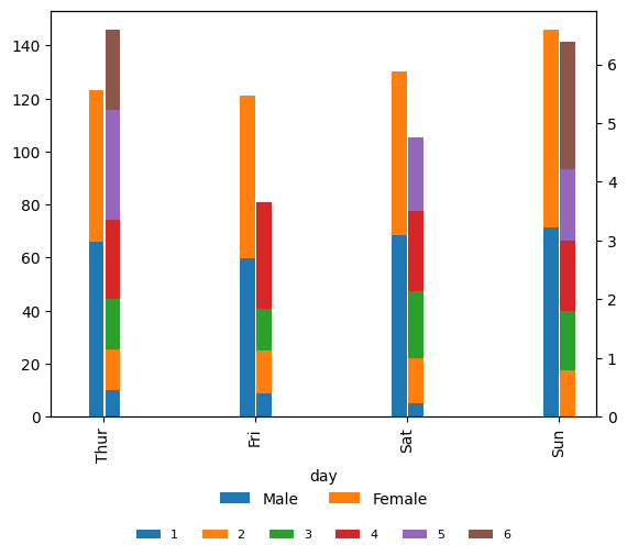
But let’s say we want to show total bill by size while tip by sex on x-axis as day. Since tip is much small compared to total_bill, we would prefer to show tips in secondary axis instead.
fig, ax = plt.subplots()
ax2=ax.twinx()

tips.plot_x(ax=ax,x='day', y='total_bill', by='size', aggfunc='mean',
          kind='bar',stacked=True,legend=True, width=+0.1 ,position=-.1)
tips.plot_x(ax=ax2,x='day', y='tip', by='sex', aggfunc='mean',
          kind='bar' , stacked=True,legend=True,dropna=True, width=+0.1 ,position=1)

#all handles and labels
h,l = ax.get_legend_handles_labels()

#handles and legends
ax.legend(h,l,bbox_to_anchor=(0.5,-0.25),ncol=10,frameon=False,loc='upper center',fontsize=8)

plt.show()
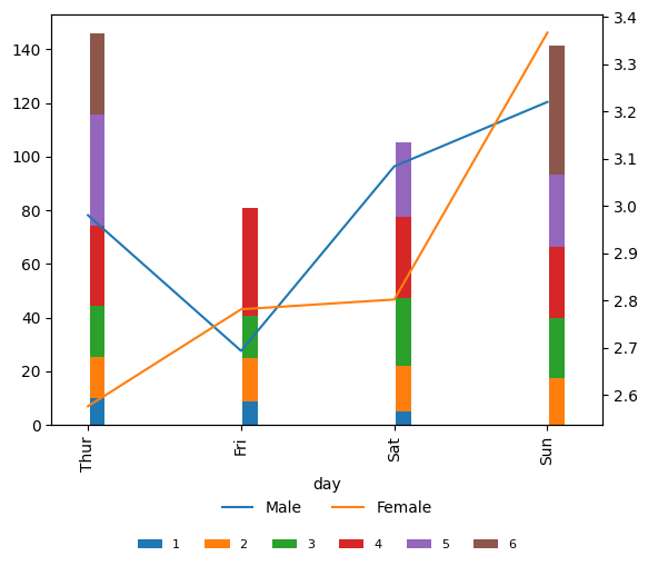
How about we show tip in line chart instead?
fig, ax = plt.subplots()
ax2=ax.twinx()
ax.clear()
ax2.clear()

tips.plot_x(ax=ax,x='day', y='total_bill', by='size', aggfunc='mean',
          kind='bar',stacked=True,legend=True, width=+0.1 ,position=-.1)
tips.plot_x(ax=ax2,x='day', y='tip', by='sex', aggfunc='mean',
          kind='line' , legend=True,dropna=True)

#all handles and labels
h,l = ax.get_legend_handles_labels()

#handles and legends
ax.legend(h,l,bbox_to_anchor=(0.5,-0.25),ncol=10,frameon=False,loc='upper center',fontsize=8)

plt.show()
We can see if we combine pandas plot and matplotlib and with just a little wrapper function the flexibility is limitless.